ESTE Label Design
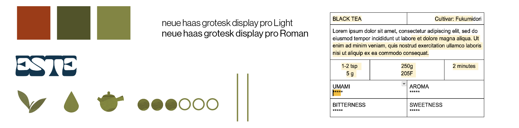
Design Iteration
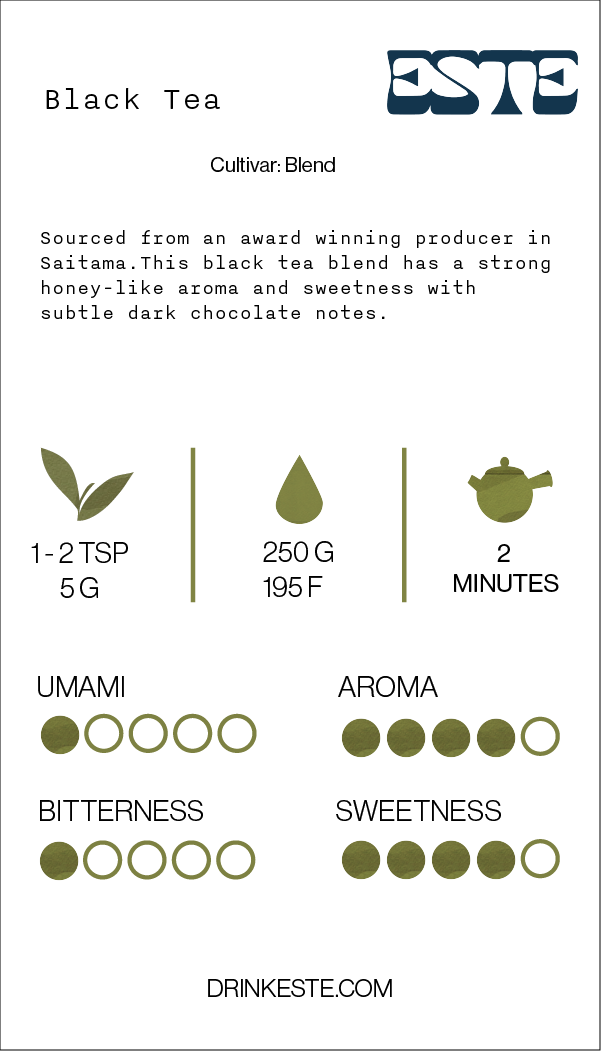
ESTE is a San Diego based company specializing in Japanese teas. They strive to share the enjoyment of tea with its wide range of tasting notes and simple every day rituals.
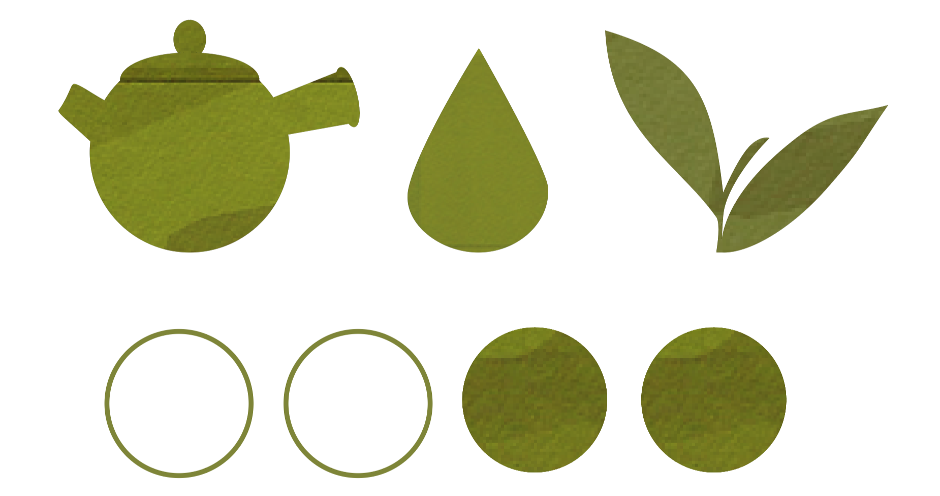
I was tasked with creating icons and a label for the back of Este’s tea packaging. The ESTE team wanted the icons to include illustrations of:
The amount of tea required for a fresh brew.
The water temperature to bring out the flavor of each type of tea.
The amount of time it would take for the tea to brew.
A scale to reflect levels of umami, aroma, bitterness, and sweetness.
I illustrated a Japanese tea leaf, teapot, water droplet, filled, and empty circles with a dark green color from Este’s branding guide. I added texture to reflect that of traditional paintings to make it look more organic and earthy.
Design Guide
Final Design